
HETAI-Assisted Creative Development
Het is a conceptual branding project for a puzzle company that transforms classical European paintings into contemporary, interactive experiences. Inspired by the Hebrew word ḥet, associated with the idea of “missing the mark,” the brand explores imperfection, fragmentation, and the relationship between individual pieces and the complete image. The concept plays with the idea that something can appear incomplete or misplaced while still belonging to a greater whole.
The project explores the integration of generative AI into the creative process, from initial research and concept development to visual experimentation, image generation, packaging design, and product mockups. Using ChatGPT alongside traditional design tools, I developed and refined the brand's visual direction, combining classical imagery with contemporary typography, unexpected compositions, and a distinctive visual identity.
Rather than allowing AI to dictate the aesthetic, I approached it as a creative collaborator, using iterative prompting and art direction to explore possibilities, refine details, and maintain consistency across applications. Het demonstrates how emerging technology can accelerate creative production while keeping human judgment, storytelling, and design craftsmanship at the center
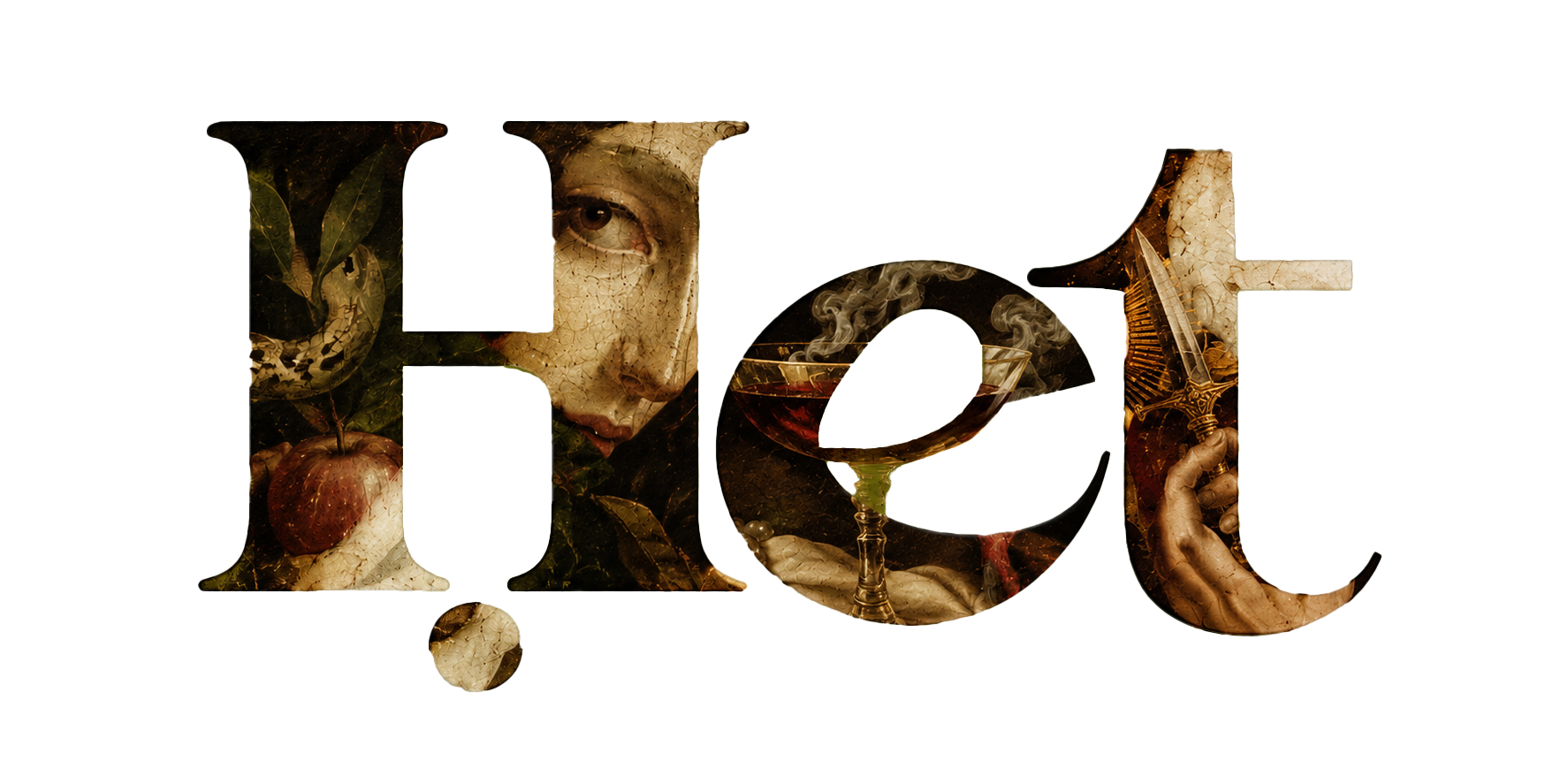
Identity
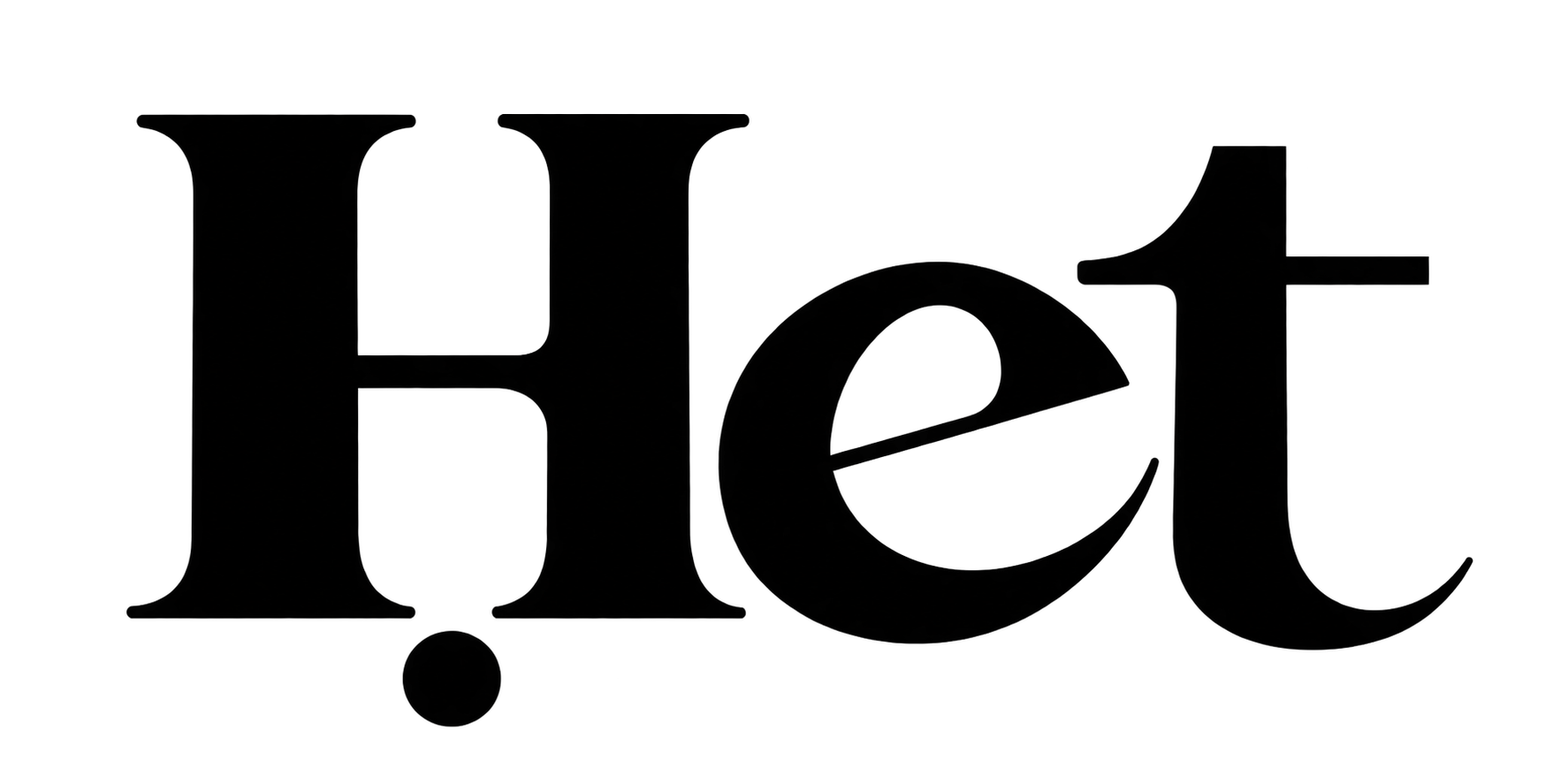
The visual identity of Het is rooted in the idea of imperfection and “missing the mark.” Drawing inspiration from classical European paintings, the logo combines traditional serif typography with fragmented imagery, creating a contrast between historical art and contemporary design. The displaced dot beneath the letter H introduces a subtle visual disruption, reinforcing the brand's central concept: that something seemingly out of place can become an intentional part of the composition. This balance between precision and imperfection carries throughout the identity, establishing a recognizable visual language for the brand.
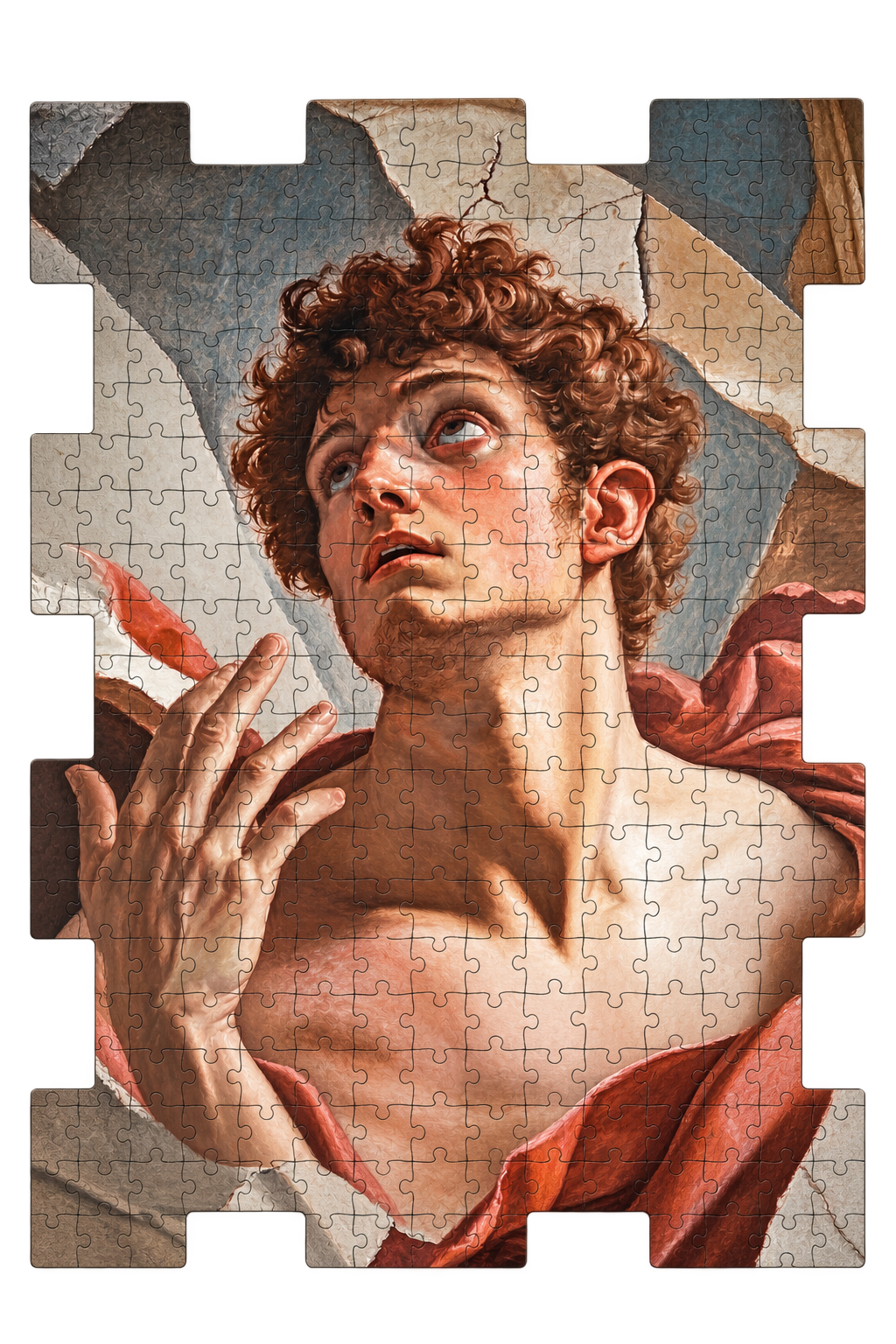
Puzzle
The puzzle's unconventional shape draws inspiration from the concept of “missing the mark,” moving beyond the traditional rectangular format while referencing the silhouettes of historical frescoes and wooden panels. Classical paintings become interactive works of art, complemented by packaging that balances rich historical imagery with a minimal, contemporary visual identity.
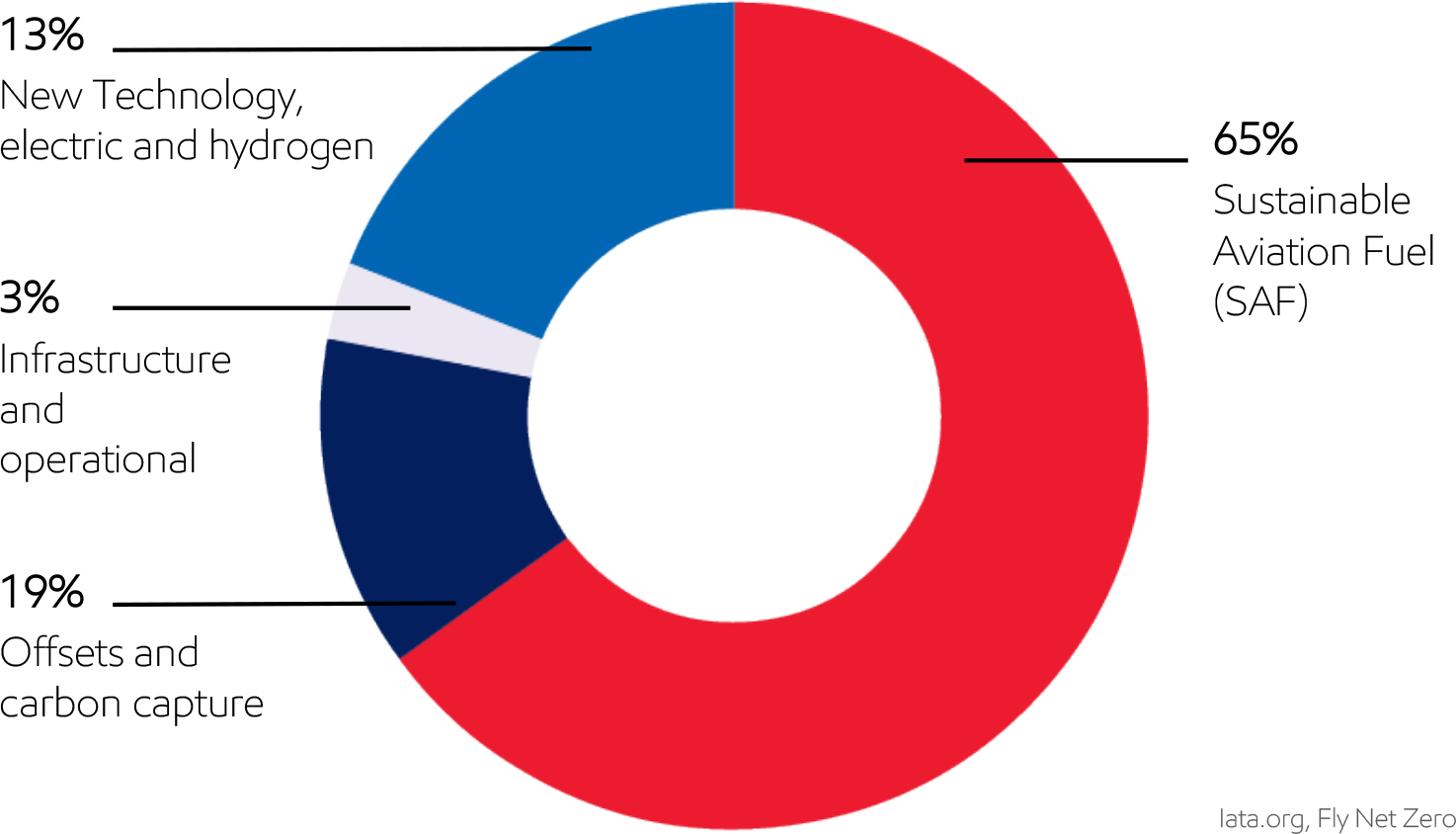
Sustainable Aviation Fuel - Position Paper
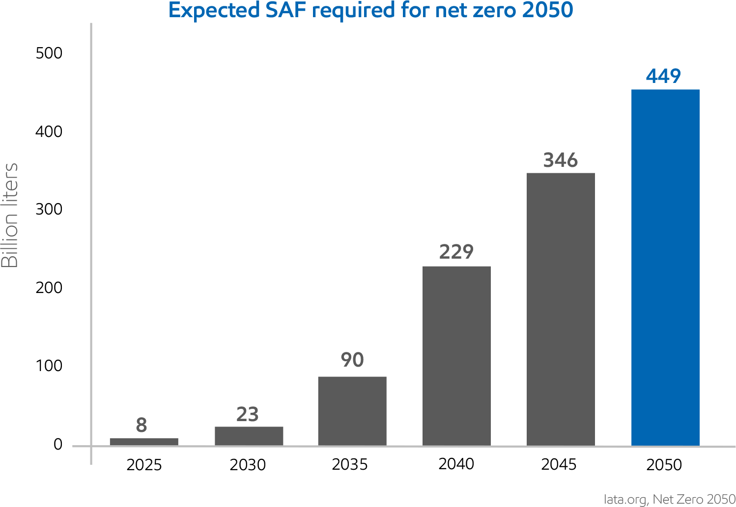
Developed the layout and visual system for the Sustainable Aviation Fuel (SAF) papers, including charts, diagrams, and supporting graphics that helped translate complex technical content into a clearer, more engaging, and easier-to-retain reading experience.
Uniform Guidelines
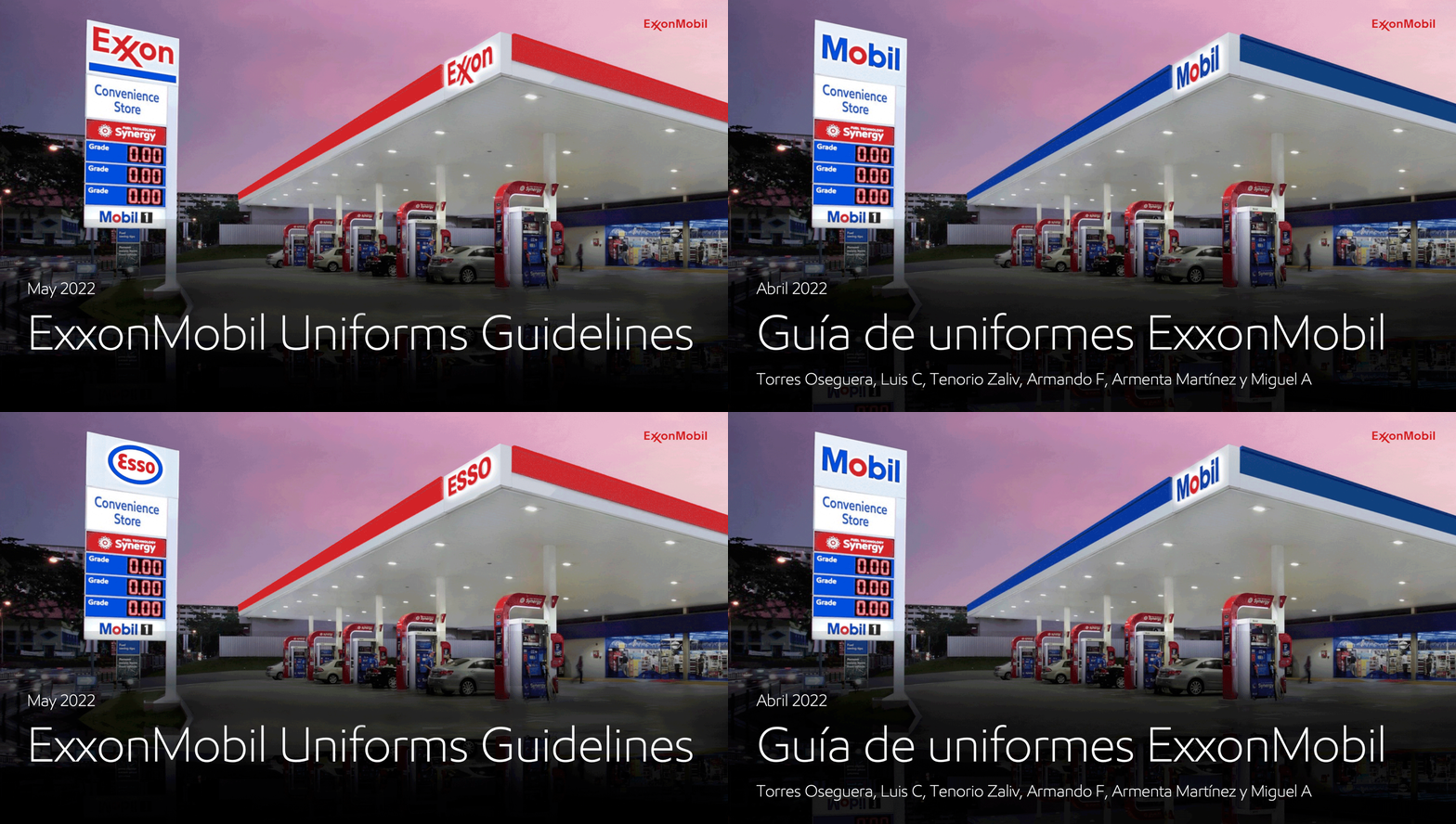
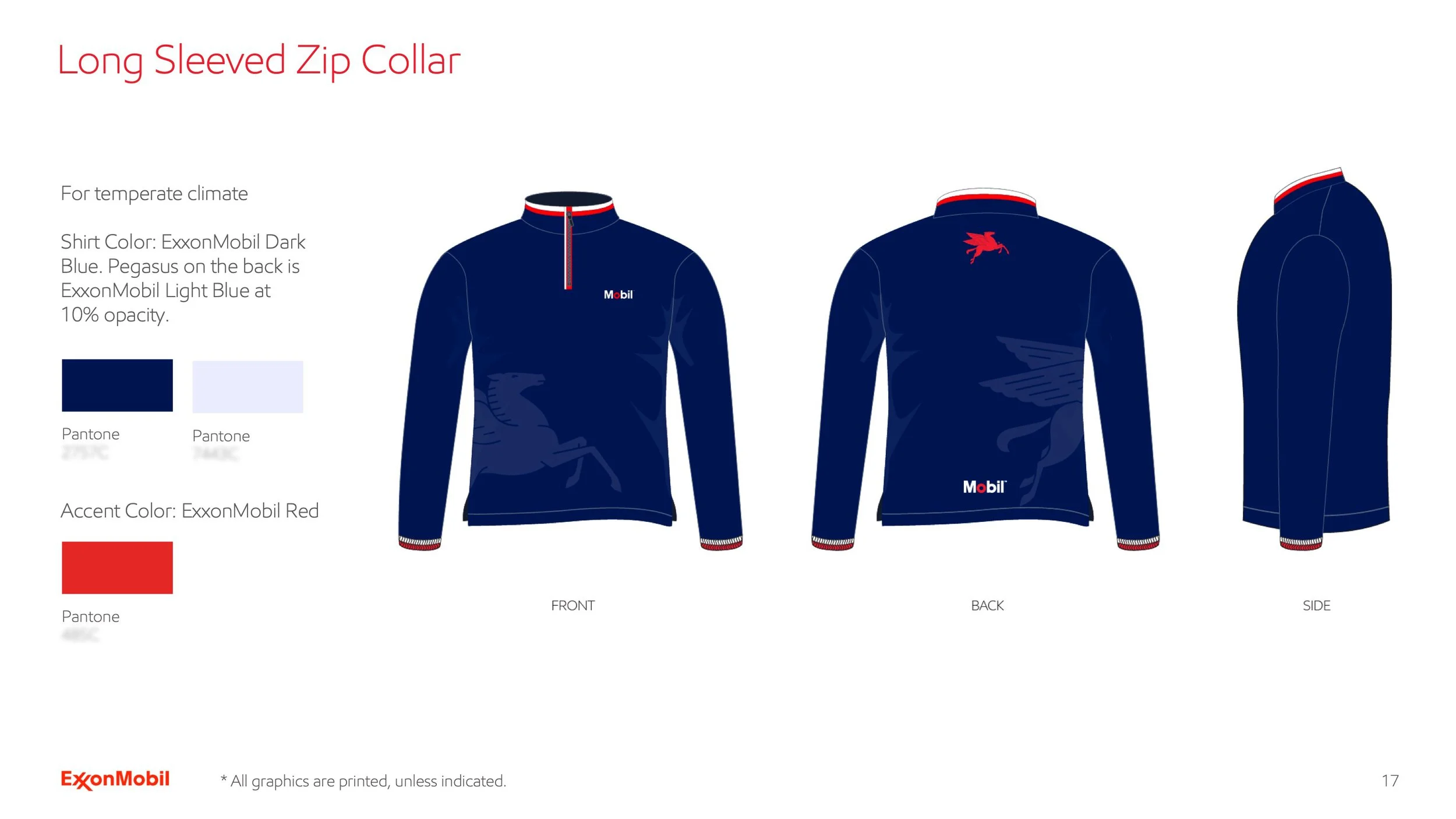
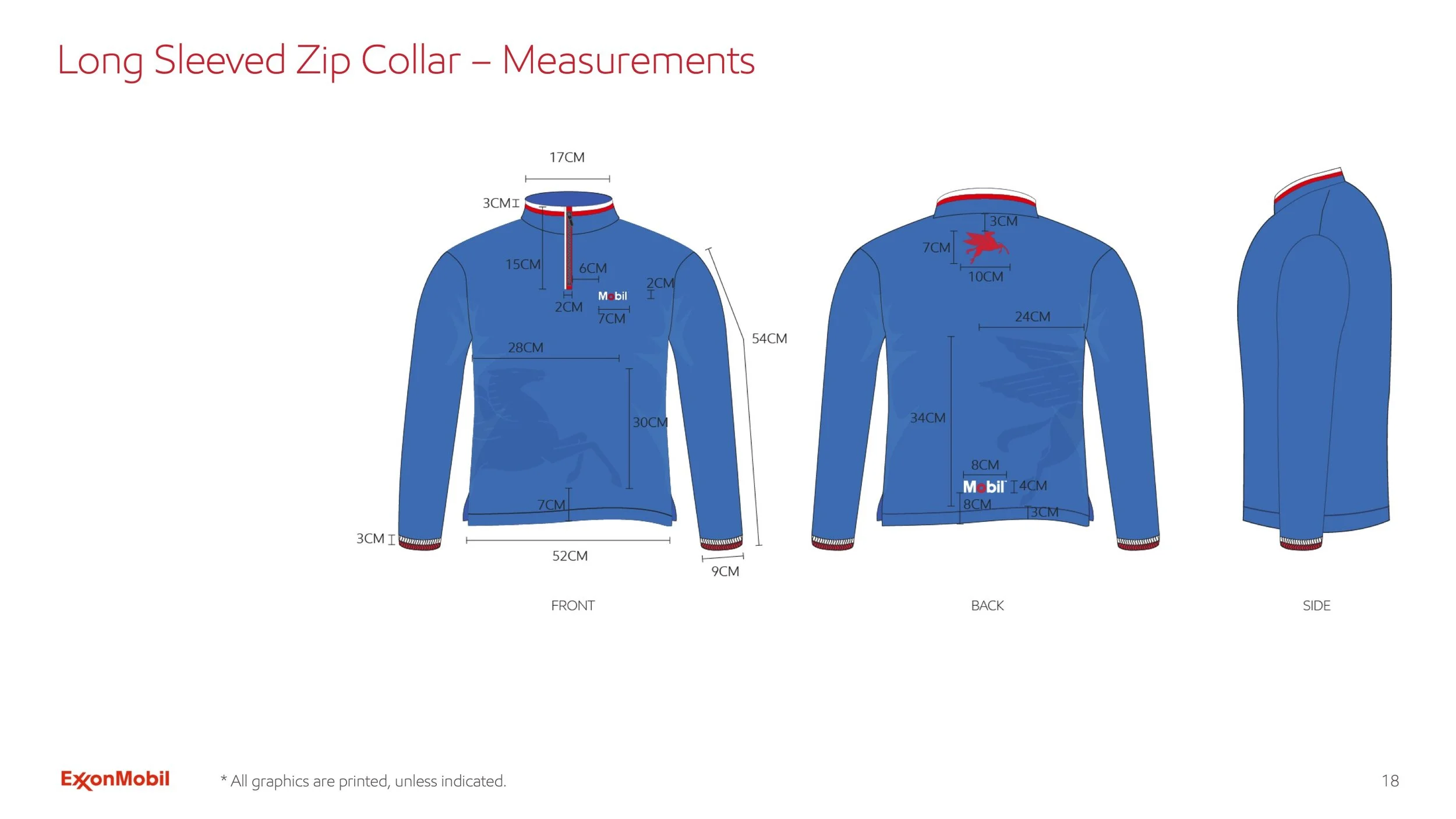
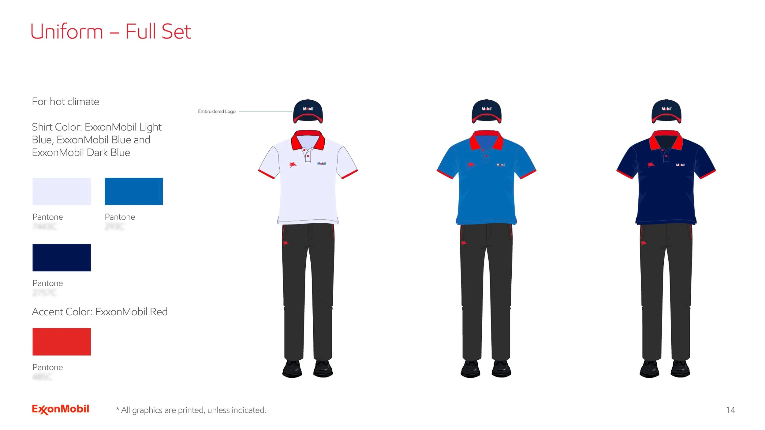
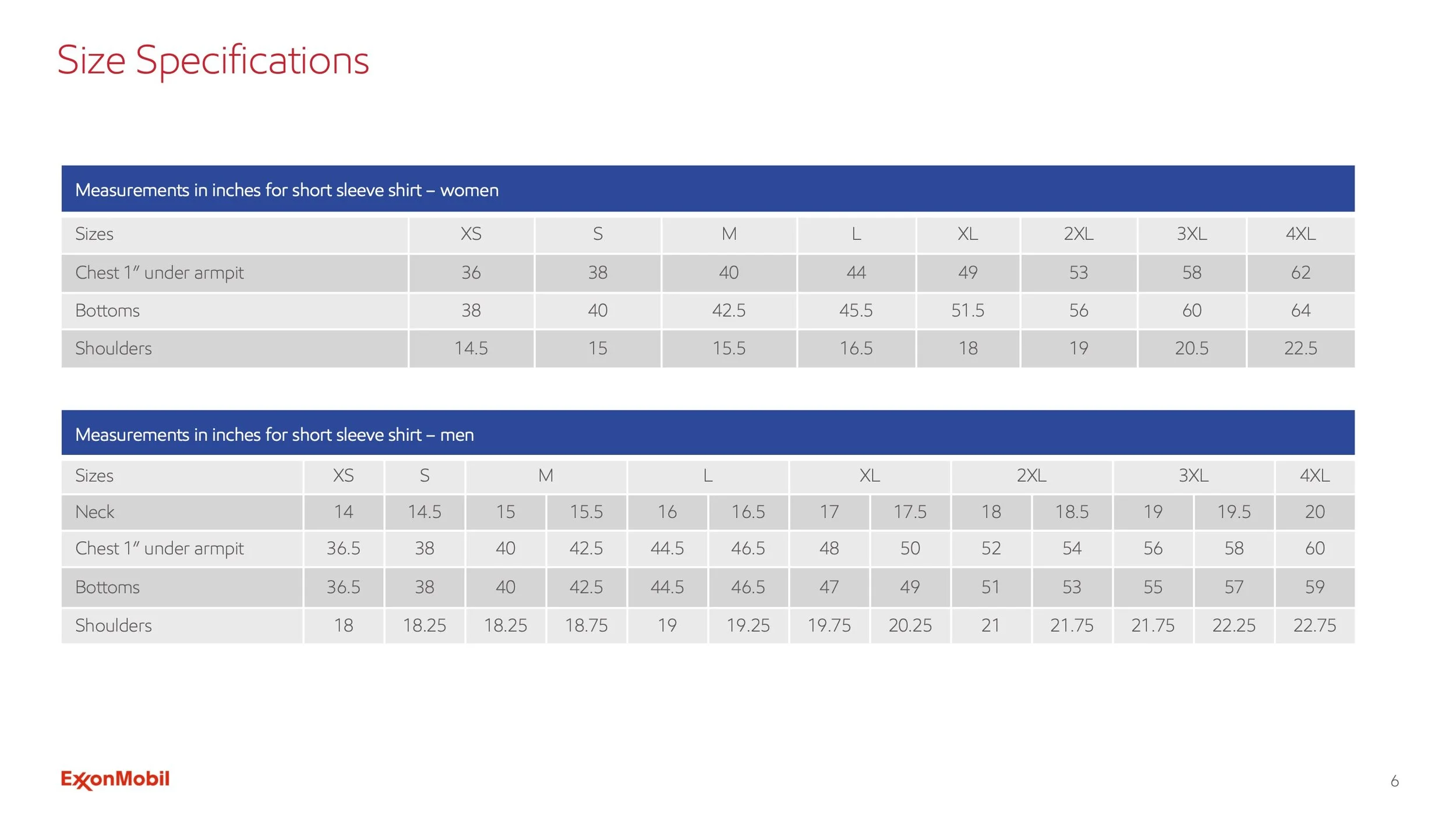
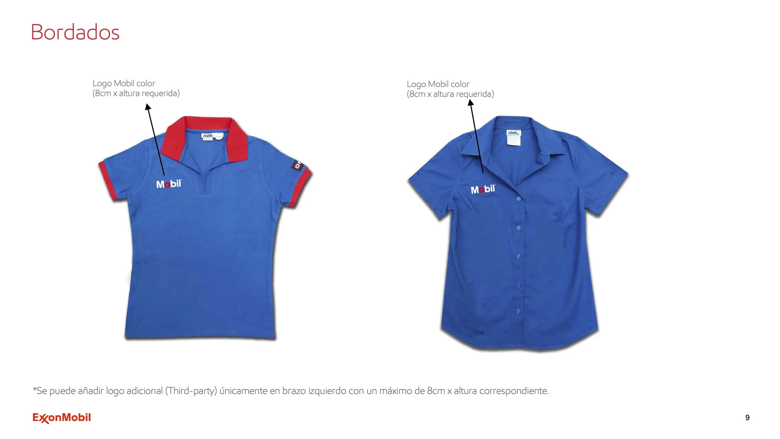
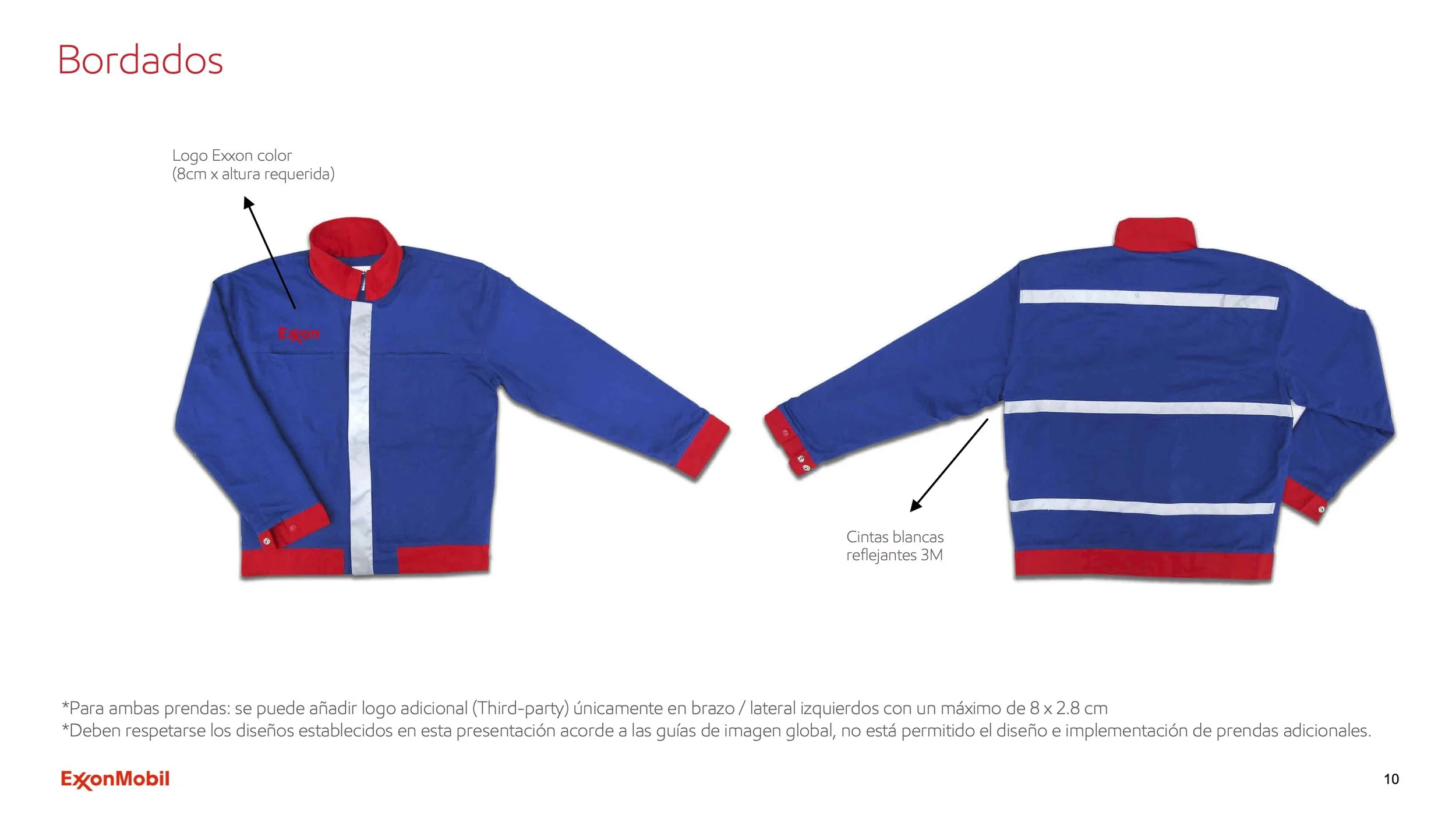
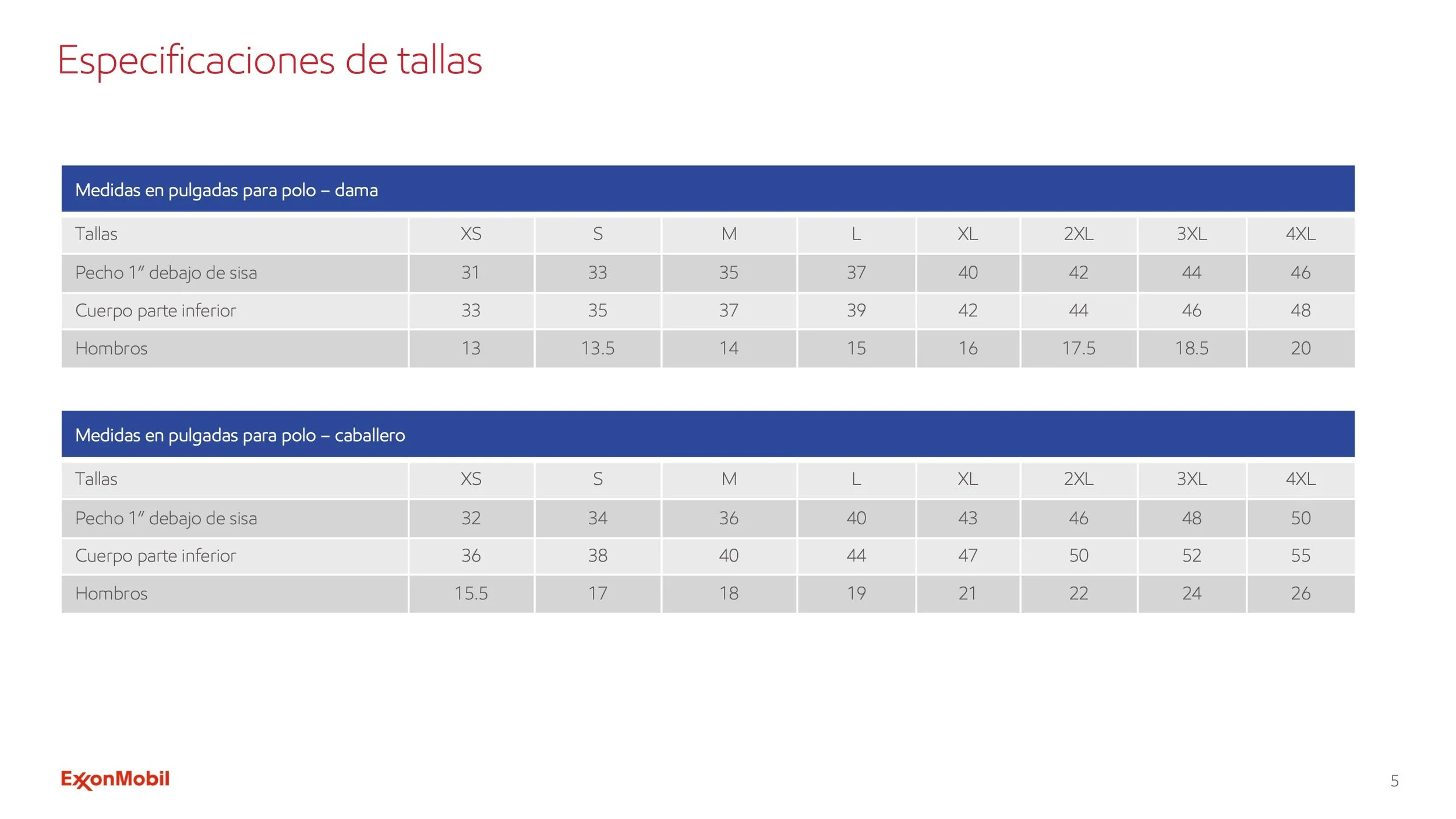
Designed a total of six uniform guideline documents across the ExxonMobil brand family (Exxon, Mobil, and Esso), developed in both English and Spanish.
Each version included subtle adaptations to reflect regional markets and cultural nuances, with color hierarchy and typographic scale tailored to each audience without losing sight of the collective. Visual language was also adjusted across versions, with the Spanish guidelines leaning more heavily on photography and the English versions incorporating more illustration-based elements. The system remained cohesive, recognizable, and consistent across the full brand family.
English
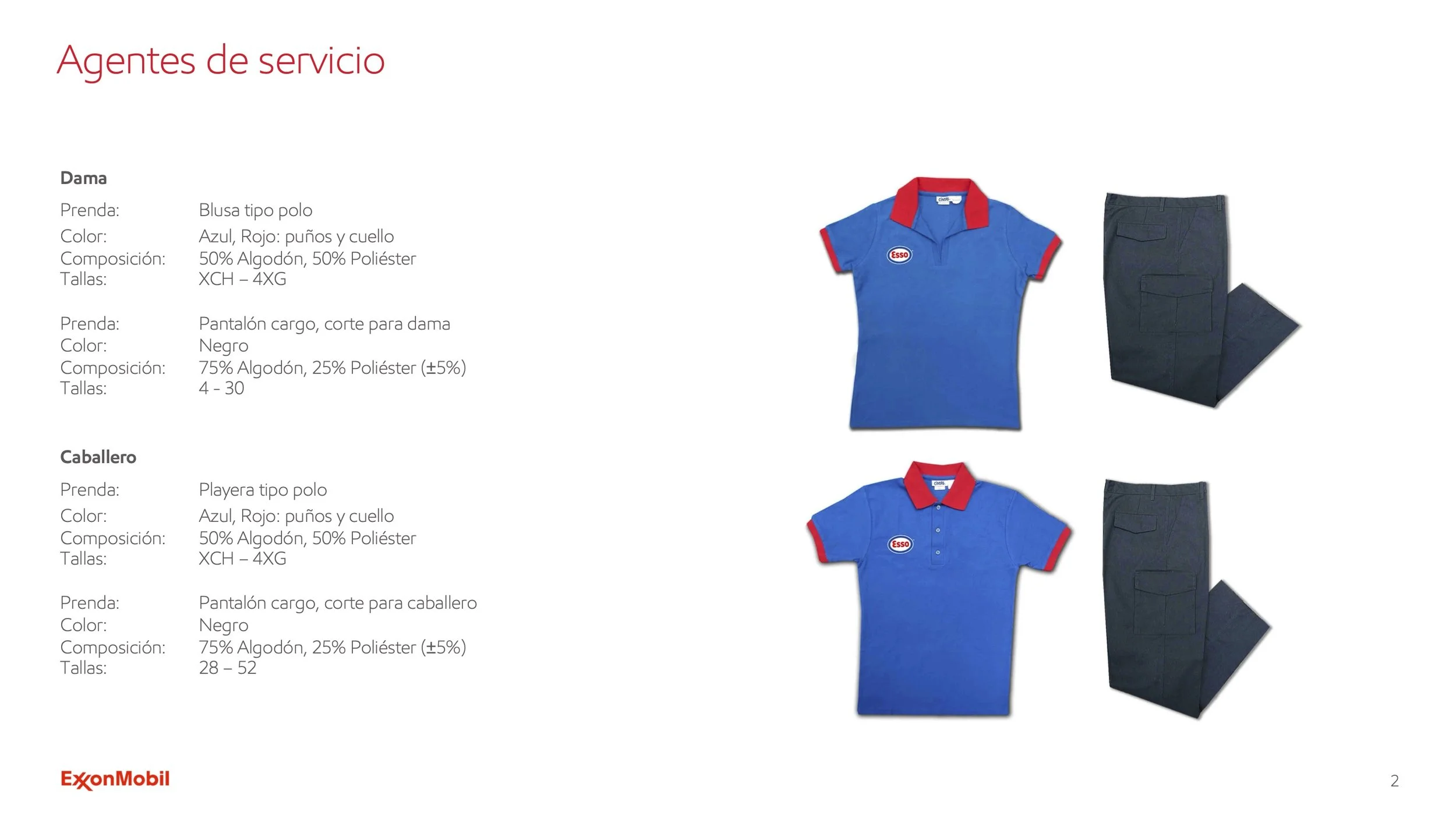
Spanish
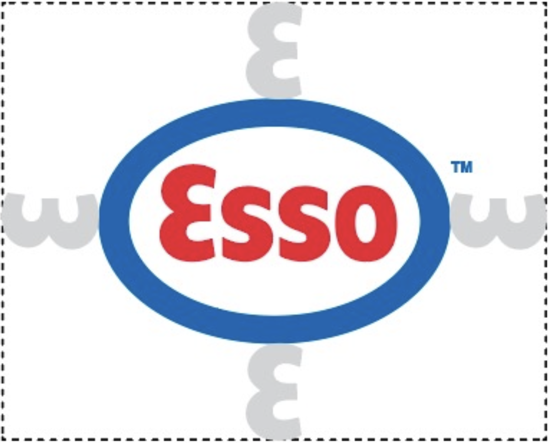
Logo Adaptations
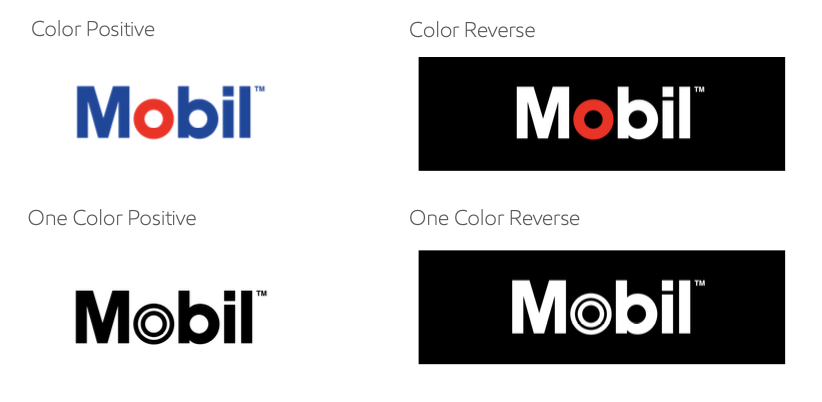
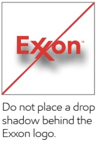
Established logo usage guidelines around sizing, clear space, and color contrast to maintain consistency, legibility, and brand integrity across all applications.
Lower Emission Solutions - Marine Paper
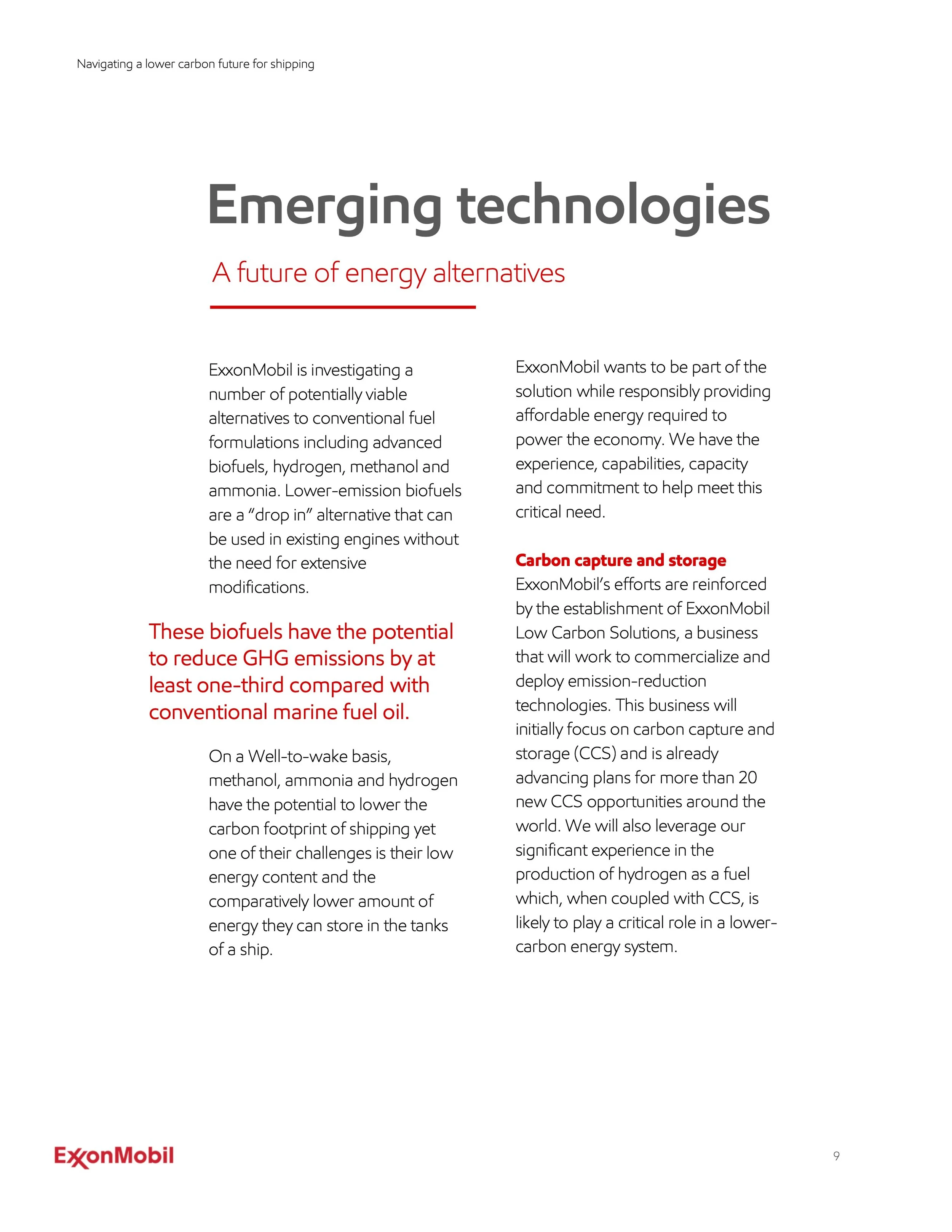
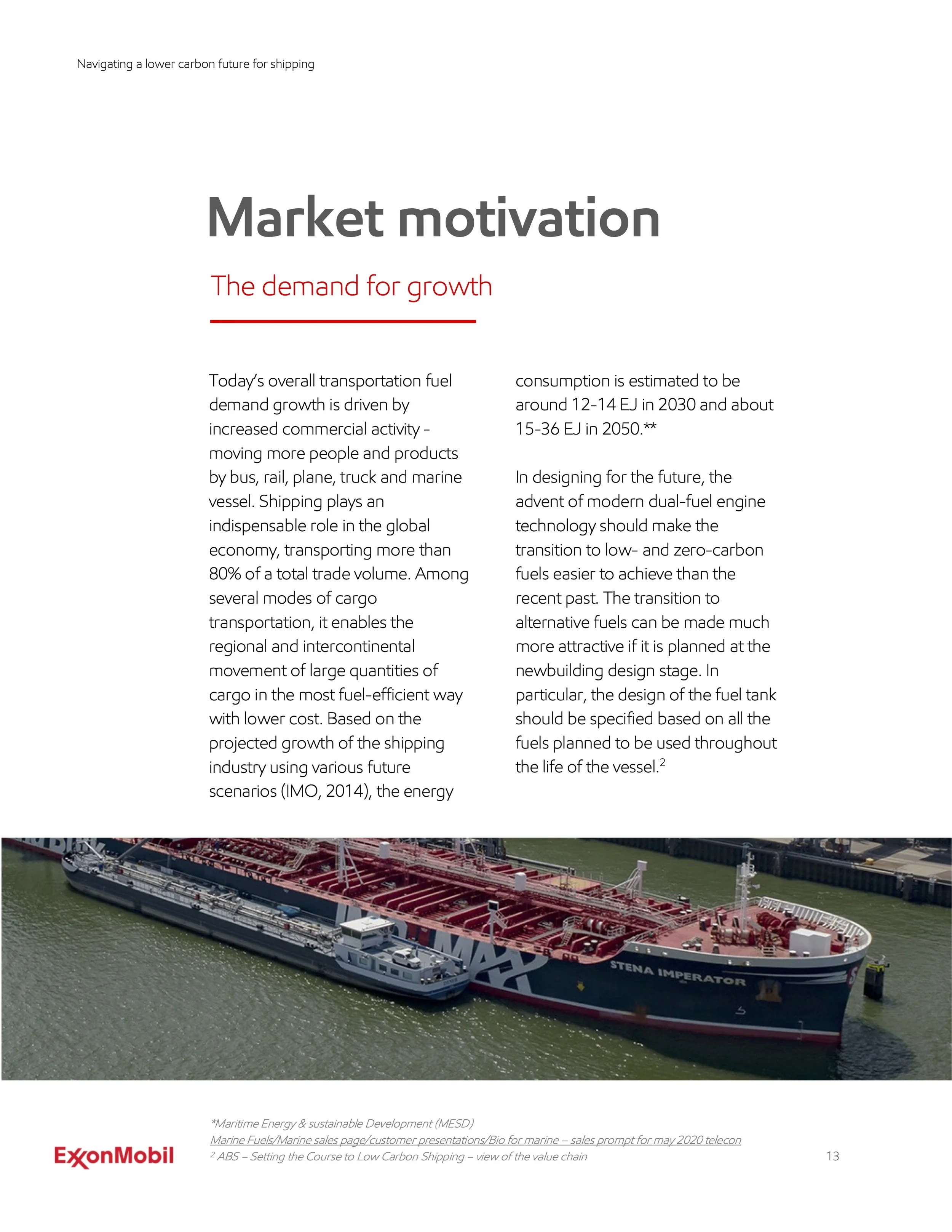
Developed the layout and visual system for the Lower Emission Marine papers, creating a clear and visually structured format that helped communicate lower-emission solutions with greater clarity, accessibility, and impact.
Originally built in InDesign and adapted into Word and PDF formats, the system maintained visual consistency across platforms while supporting readability and accessibility in final delivery. Charts, diagrams, and supporting visuals were integrated throughout to help clarify key information and make dense material more digestible and engaging.
Graphics & Illustrations
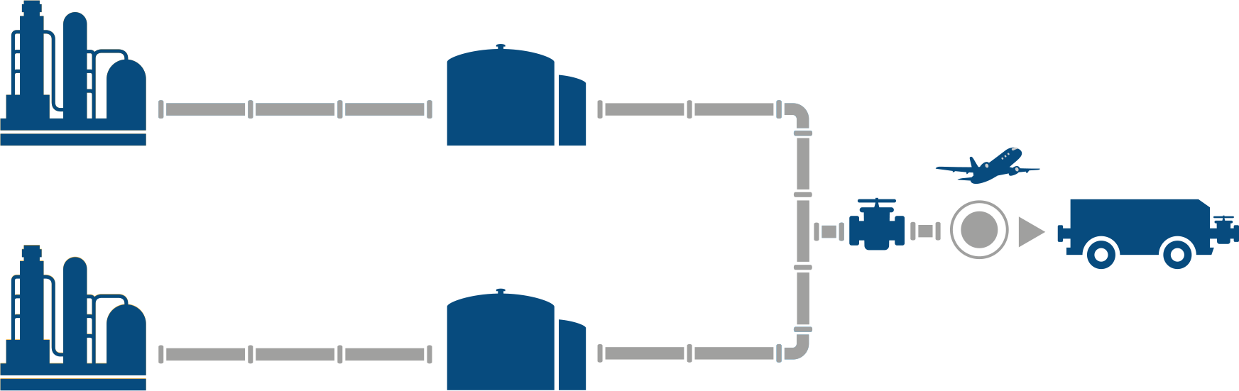
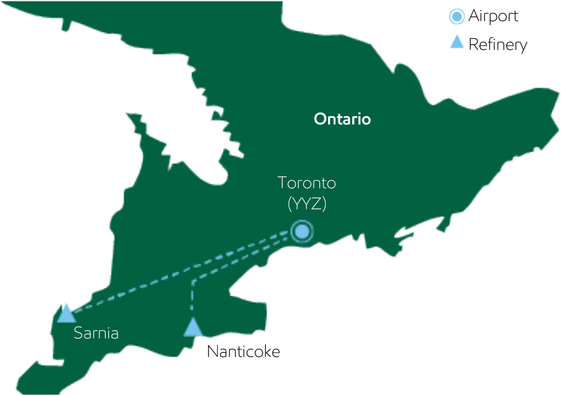
Graphic implementation focused on supporting content through visual elements that helped reinforce hierarchy, improve readability, and create a more cohesive overall system.
DIRECTV EXXONMOBIL W.BRITT FLAWLESS PANASONIC SAPPHIC HOUSE MICROTOUCH