
exxonmobilArt Director
Led the visual development and design execution of a range of B2B brand materials for ExxonMobil, helping translate complex corporate and technical information into clear, visually cohesive communications across print and digital formats. Worked across multiple brand touchpoints within the ExxonMobil family, including Exxon, Mobil, and Esso, while maintaining consistency, hierarchy, and brand integrity throughout. Some materials were developed in both English and Spanish to support broader communication needs across audiences and markets.
Additional work included the creation of brand guidelines, uniform guidelines, shareholder-facing sustainability and aviation documents, and promotional video assets, supporting both internal and external communication needs. In close collaboration with creative leads, designers, and project managers, the work focused on layout hierarchy, typography, and information design, balancing technical clarity with strong visual storytelling and brand continuity.
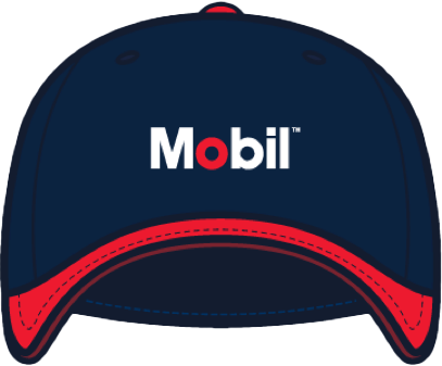
Logo embroidery


Pantone XXC
Pantone XXC
Uniform Guidelines – Cap

Identity
Implemented ExxonMobil’s visual identity, centered on ExxonMobil’s signature red, while adapting secondary color systems across the brand family (Exxon, Mobil, and Esso) and establishing a clean typographic hierarchy. Ensuring consistency and creating a system that was easy to navigate and differentiate.
Supporting brand consistency for 60K+ employees globally.
Brand Usage - Guidelines






Pantone XXC
Pantone XXC
Pantone XXC
Pantone XXC
Pantone XXC
Pantone XXC

Lower Emissions - Transportation Paper
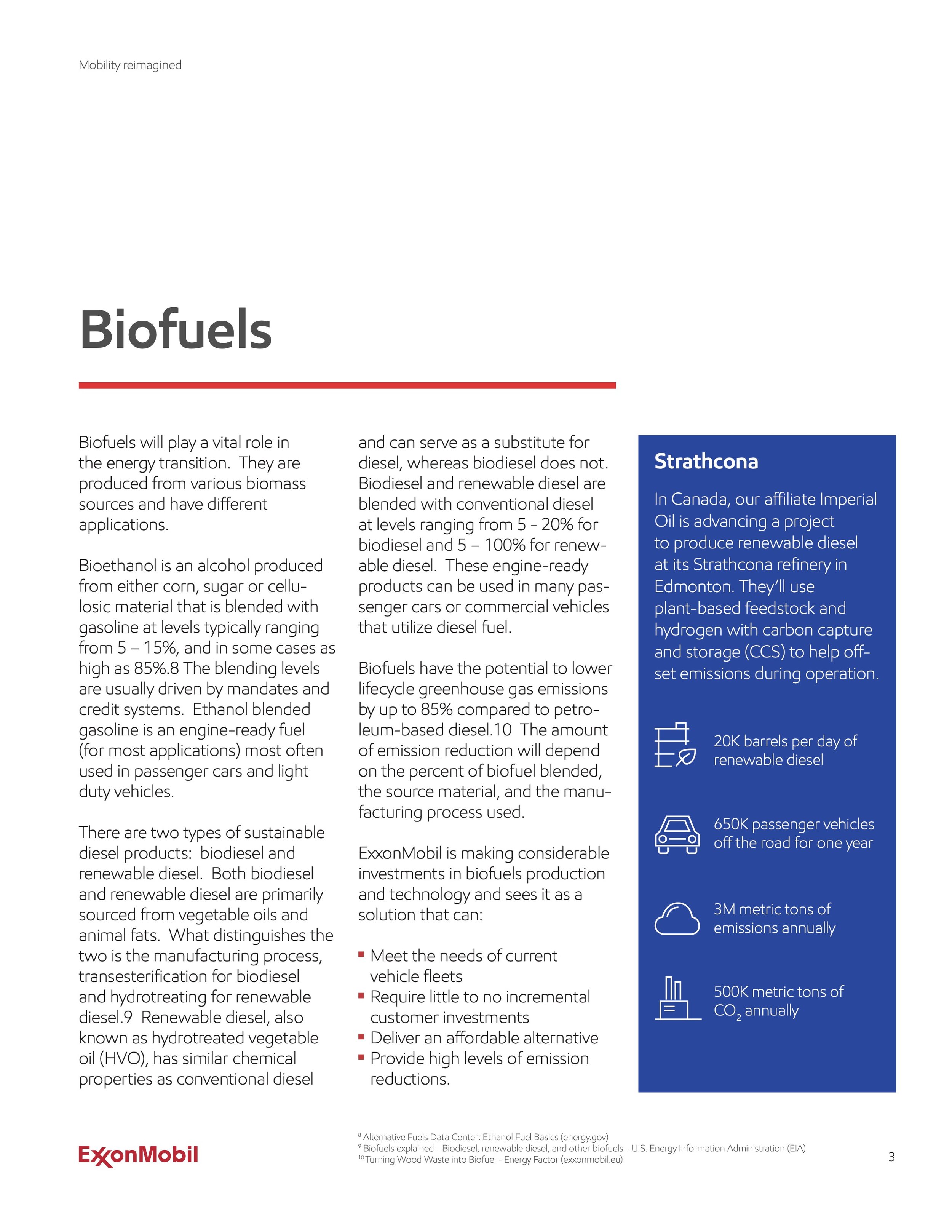
Built on a three-column grid system, the page layout used a structured and consistent framework to align, balance, and organize dense technical content with greater clarity.
Sustainable Aviation Fuel - Position Paper
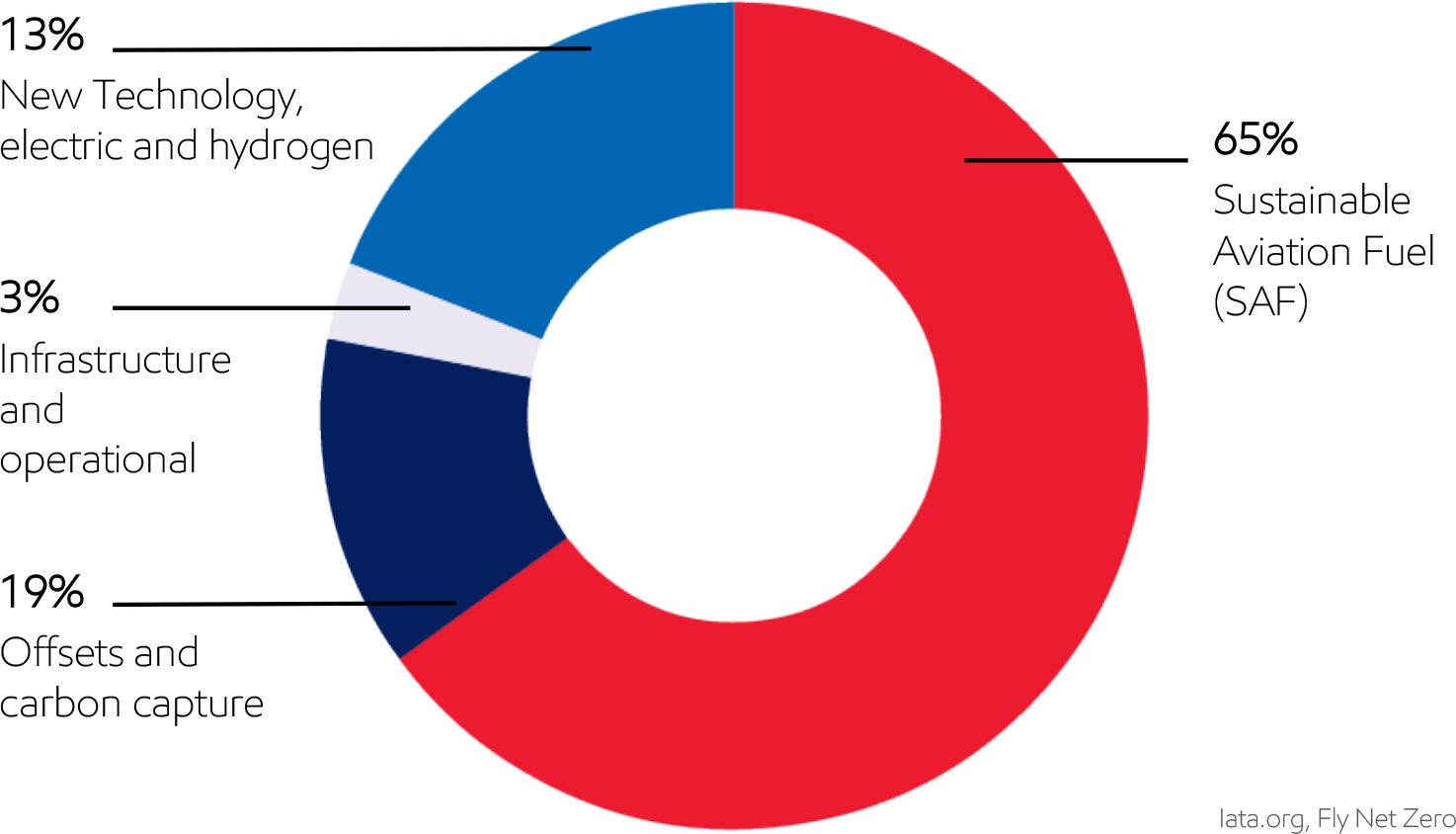
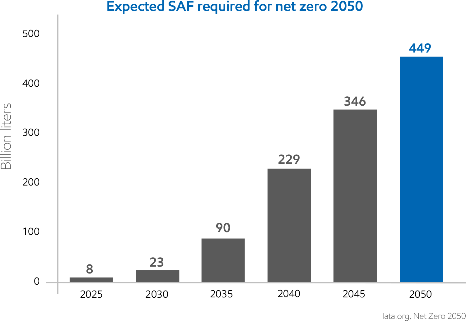
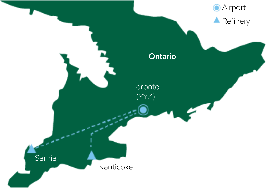
Developed the layout and visual system for the Sustainable Aviation Fuel (SAF) papers, including charts, diagrams, and supporting graphics that helped translate complex technical content into a clearer, more engaging, and easier-to-retain reading experience.
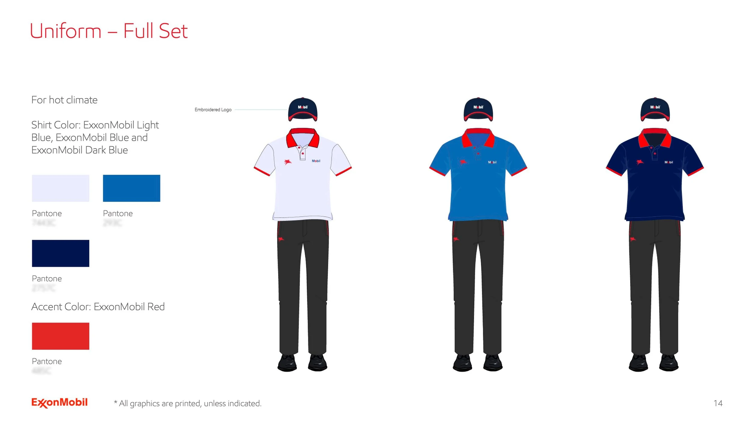
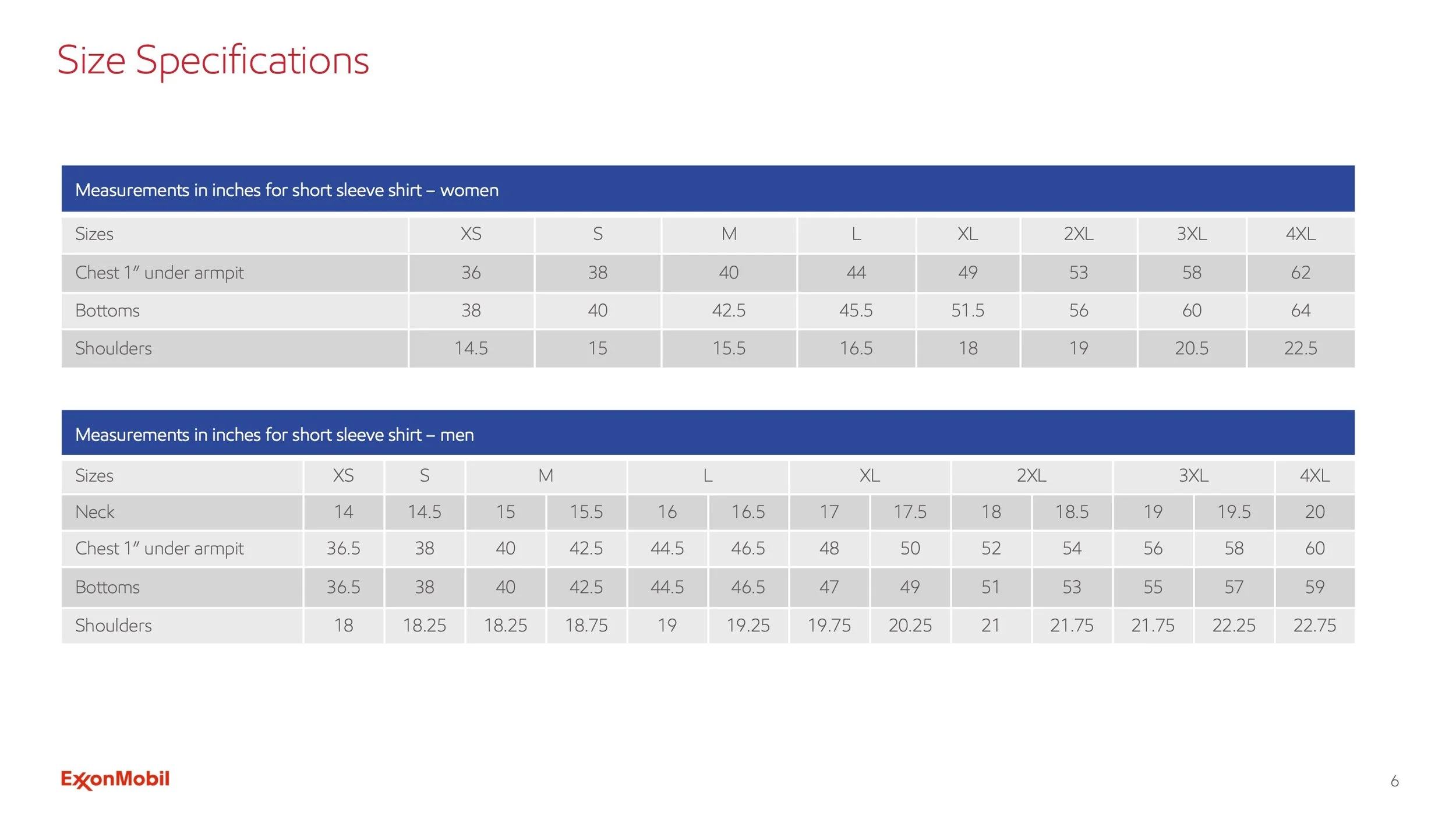
Uniform Guidelines
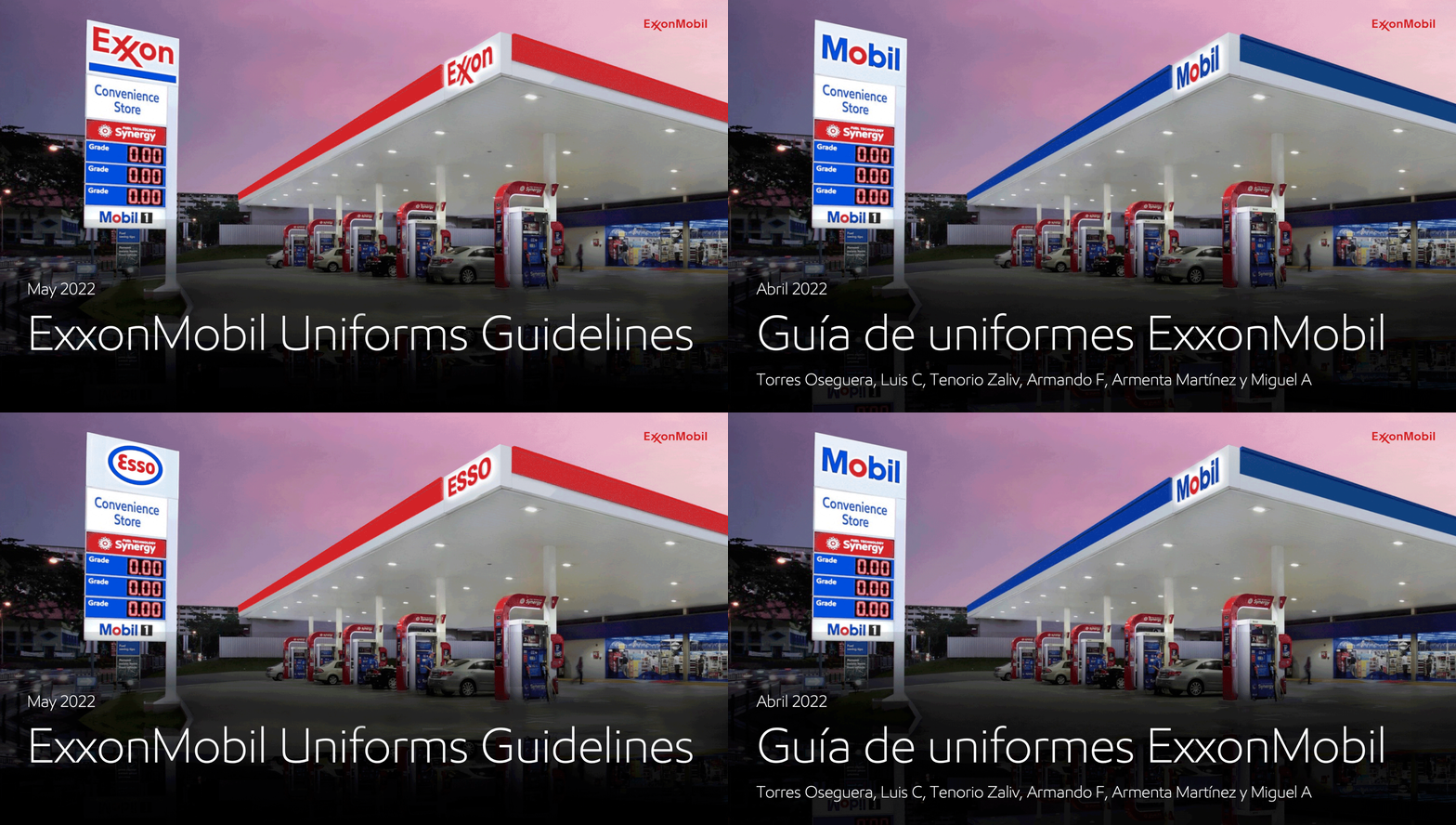
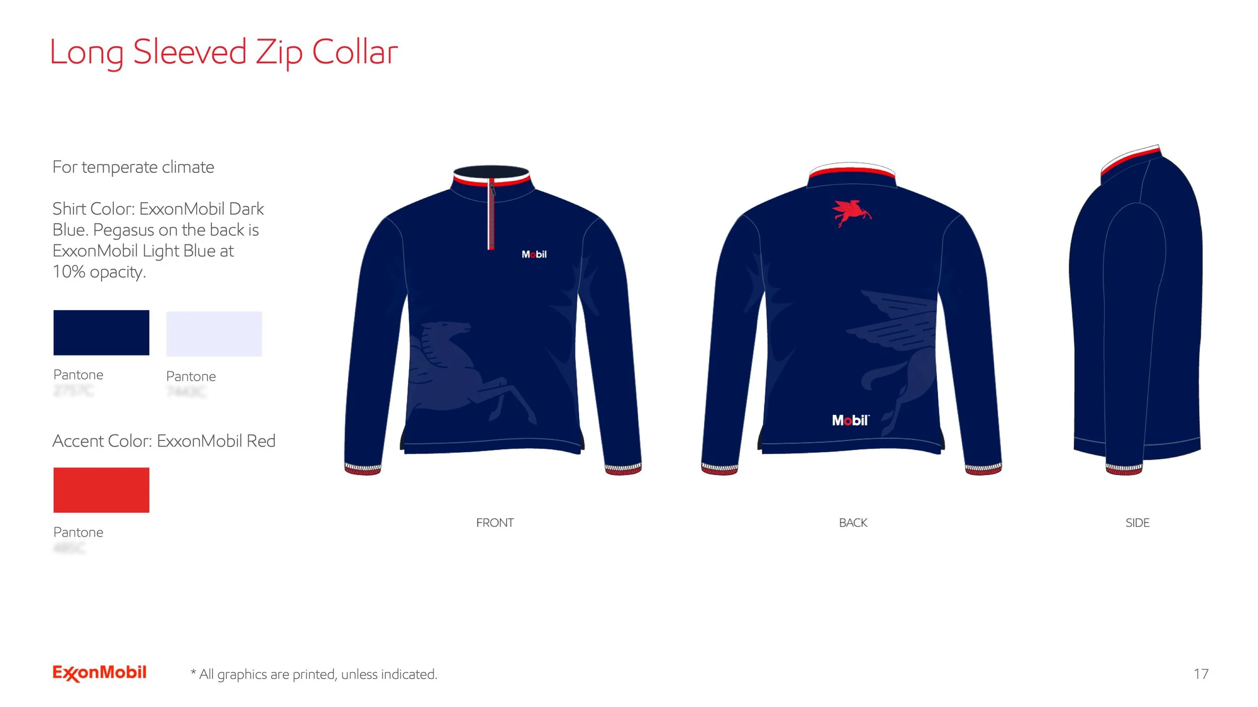
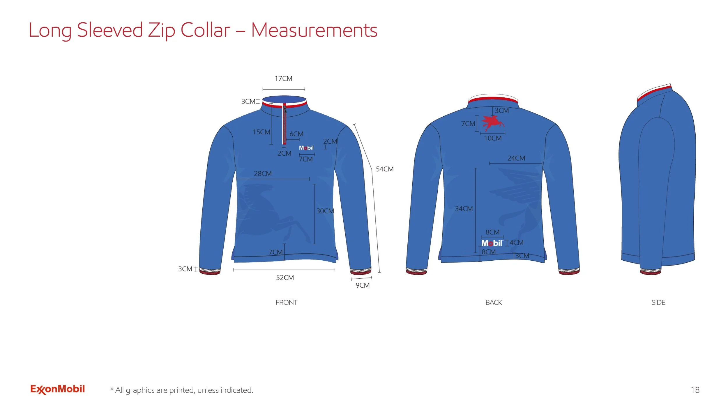
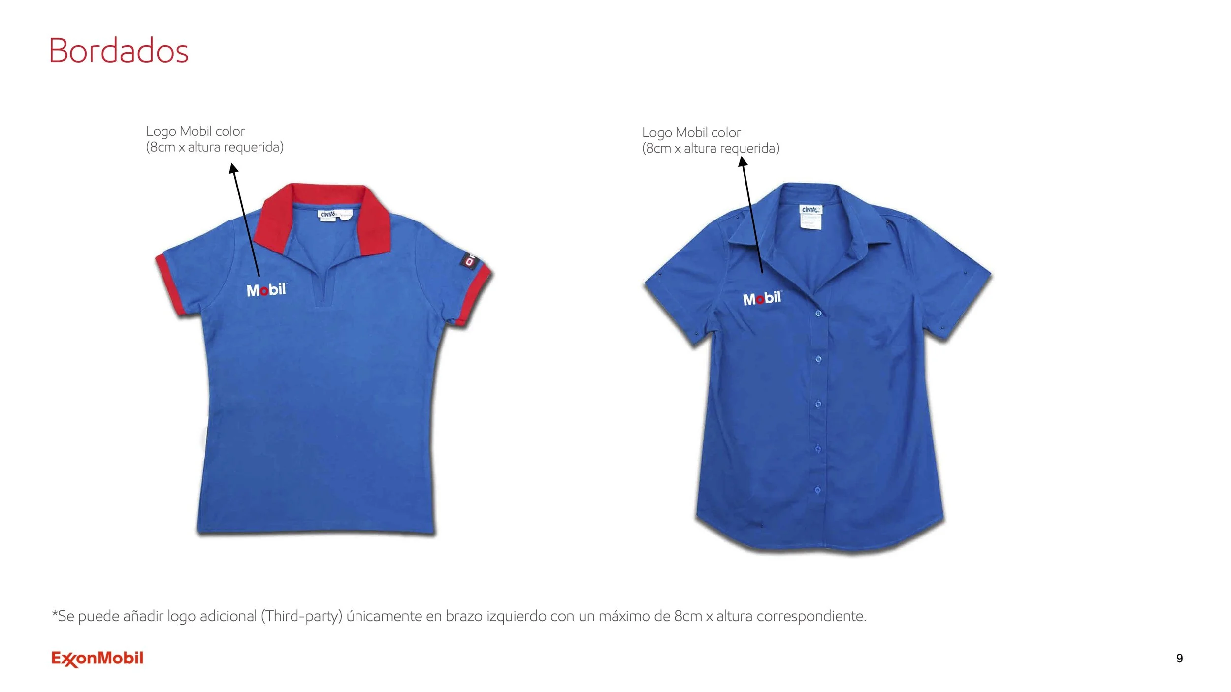
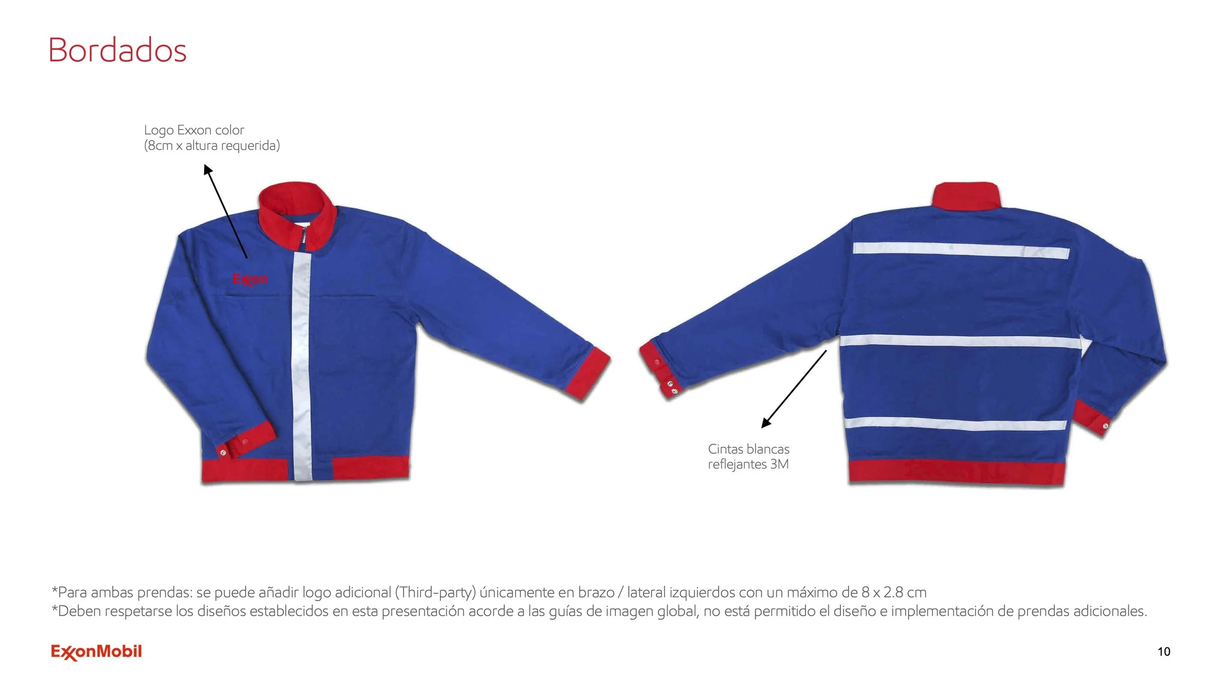
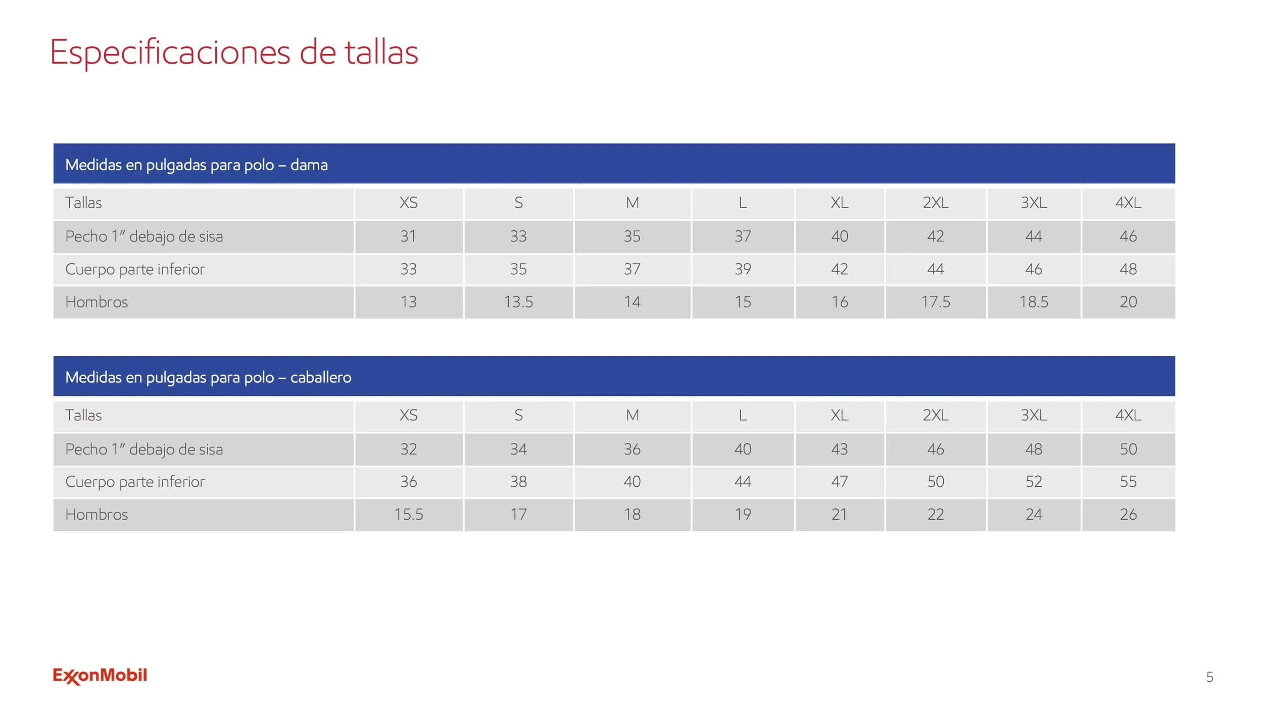
Designed a total of six uniform guideline documents across the ExxonMobil brand family (Exxon, Mobil, and Esso), developed in both English and Spanish.
Each version included subtle adaptations to reflect regional markets and cultural nuances, with color hierarchy and typographic scale tailored to each audience without losing sight of the collective. Visual language was also adjusted across versions, with the Spanish guidelines leaning more heavily on photography and the English versions incorporating more illustration-based elements. The system remained cohesive, recognizable, and consistent across the full brand family.
English
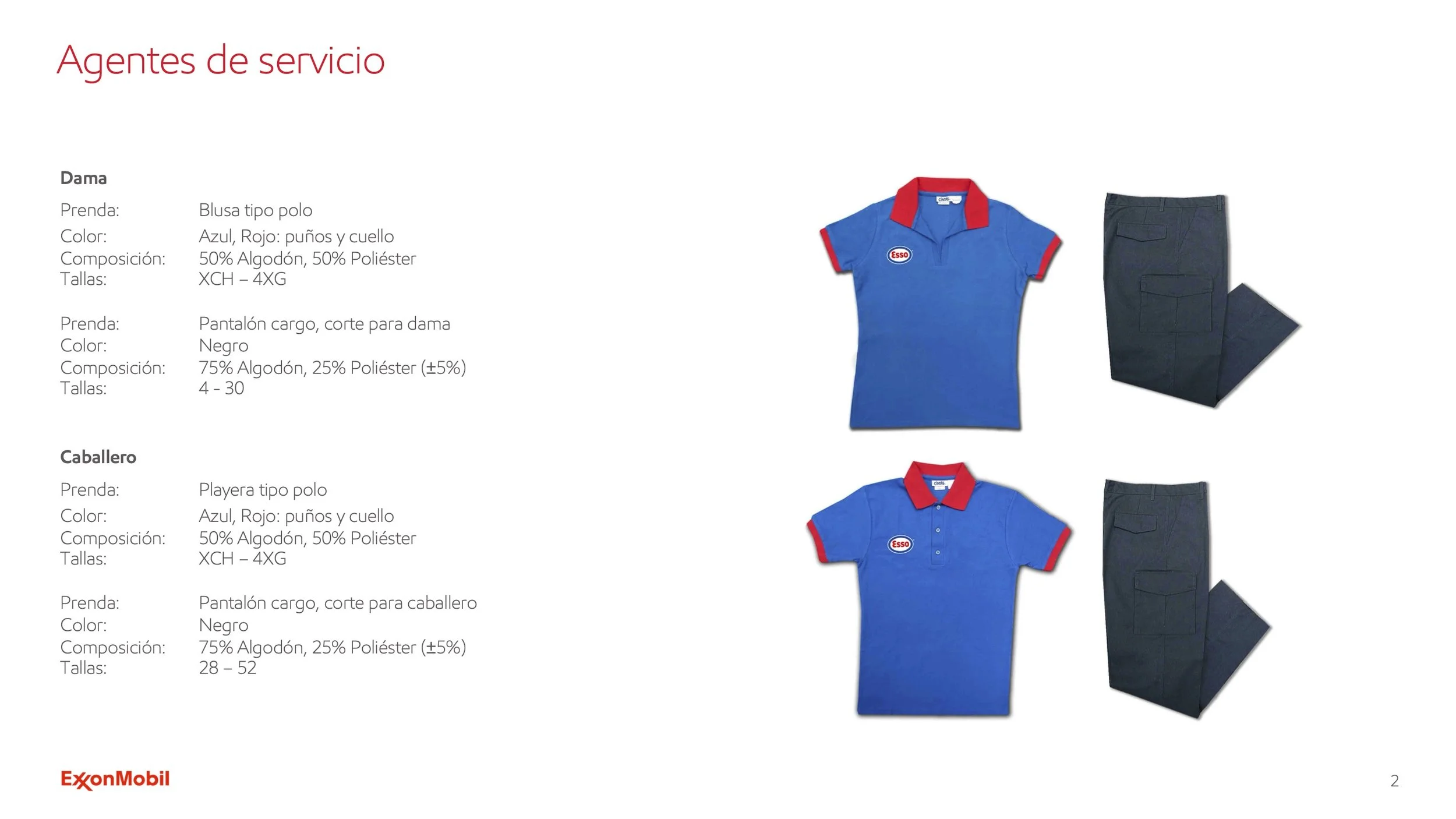
Spanish
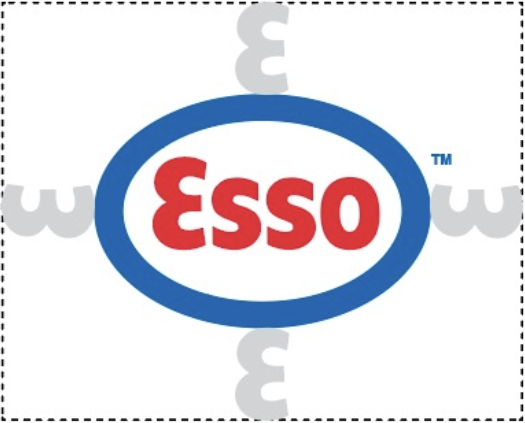
Logo Adaptations
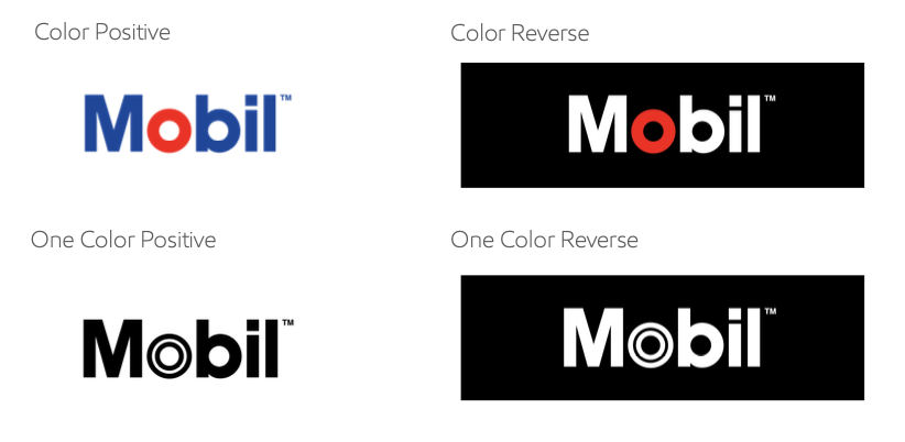
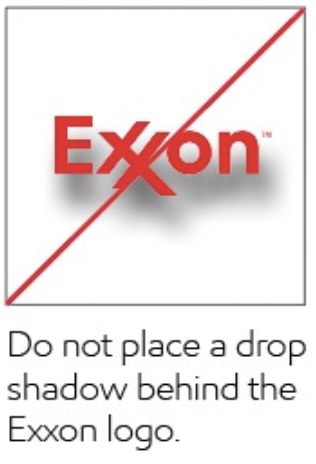
Established logo usage guidelines around sizing, clear space, and color contrast to maintain consistency, legibility, and brand integrity across all applications.
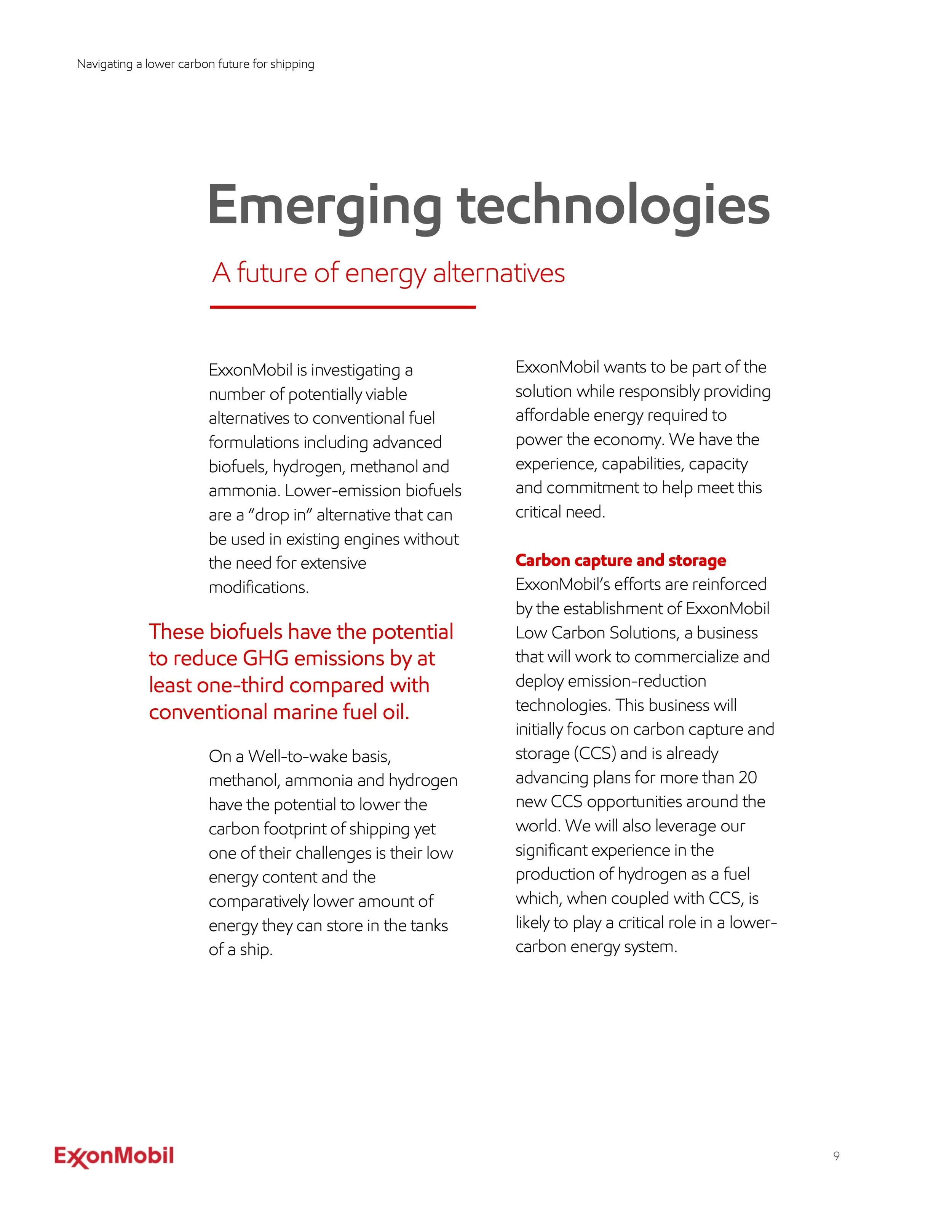
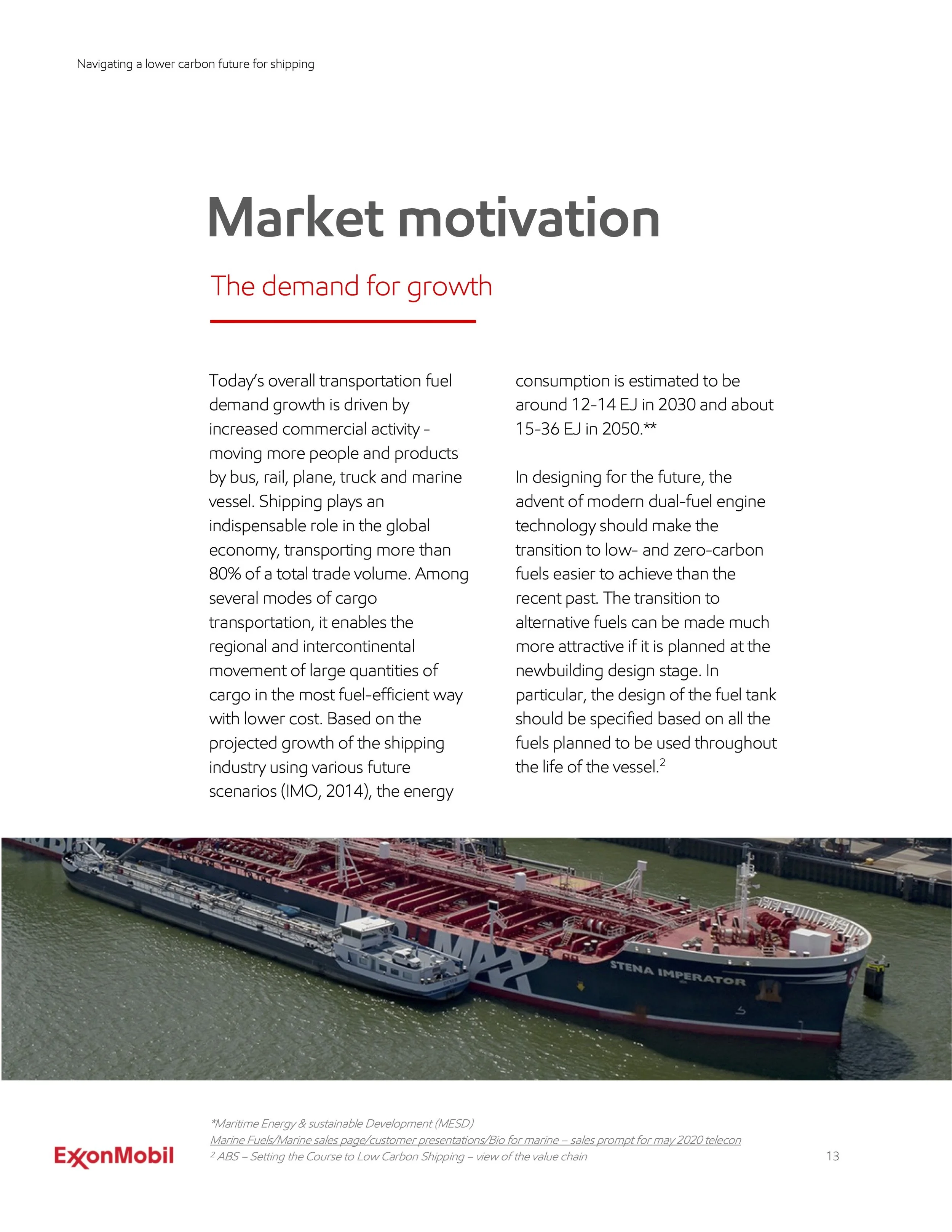
Lower Emission Solutions - Marine Paper
Developed the layout and visual system for the Lower Emission Marine papers, creating a clear and visually structured format that helped communicate lower-emission solutions with greater clarity, accessibility, and impact.
Originally built in InDesign and adapted into Word and PDF formats, the system maintained visual consistency across platforms while supporting readability and accessibility in final delivery. Charts, diagrams, and supporting visuals were integrated throughout to help clarify key information and make dense material more digestible and engaging.
Graphics & Illustrations
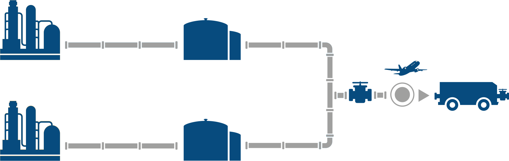
Graphic implementation focused on supporting content through visual elements that helped reinforce hierarchy, improve readability, and create a more cohesive overall system.
DIRECTV EXXONMOBIL W.BRITT FLAWLESS PANASONIC SAPPHIC HOUSE MICROTOUCH